How to Design a Management KPI Dashboard?
Learn how to design an effective KPI dashboard for your SME, turning complex data into actionable insights for proactive, strategic management.
Managing a manufacturing-focused SME often requires fighting on multiple fronts at once. Production planning, supply chain disruptions, machine breakdowns, and quality control issues are integral parts of daily operations. In this complex environment, managers often make decisions based on their experience and intuition. However, in today's market where competition is intensifying and margins are narrowing, relying solely on intuition is a risky approach. This is where a well-designed management KPI dashboard acts as a compass, showing the business's real-time health and enabling the shift from reactive problem-solving to proactive strategy development.
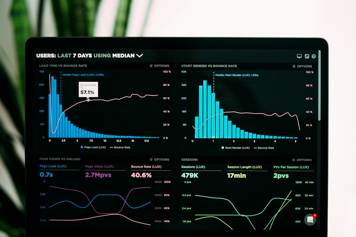
A KPI dashboard is a tool that transforms complex data sets and lengthy reports into visual graphics that are understandable at a glance. Its purpose is to answer a manager's most critical questions in seconds: “How close are we to our goals?”, “Which area is experiencing problems?”, “Where is urgent intervention needed?”. The value of this dashboard comes not from the technology or colourful graphics it contains, but from its ability to guide management to action by prompting the right questions. In this article, we will discuss, step-by-step, how to design a tangible and applicable management KPI dashboard tailored to the needs of an SME manager.
Strategic Goals and KPIs: Where to Begin?
The first step in designing an effective dashboard is not to choose technology or start collecting data. The first step is to clarify the company's strategic goals. A dashboard is only as meaningful as the goals it measures. As a management team, you must ask yourselves: “What are the 3-5 most important goals we want to achieve as a company in the next 1-2 years?” These goals should be concrete and measurable, such as “increase profitability by X%”, “improve production efficiency by Y%”, “reduce scrap rate below Z%”, or “increase customer satisfaction”.
Once each strategic goal is set, Key Performance Indicators (KPIs) must be defined to measure progress towards that goal. The word “Key” is of critical importance here. From hundreds of metrics, it is necessary to select the most critical ones that best represent success in achieving the goal. For example, for the goal of “improving production efficiency”, potential KPIs could be Overall Equipment Effectiveness (OEE), average cycle time per machine, or unplanned downtime. This choice is directly related to how well the business understands its own processes and dynamics. An operations map that clearly outlines your processes and their interrelationships will serve as a fundamental reference point in determining which metrics are truly “key”.
Choosing the Right Metrics: "Should Everything That Can Be Measured Be Measured?"
One of the most common mistakes in the transition to data-driven management is the desire to include every measurable piece of data on the dashboard. This leads to information overload and a loss of focus, a condition also known as “analysis paralysis”. A dashboard with dozens of charts can be as dysfunctional as one with no charts at all. Therefore, when selecting metrics, it is necessary to prioritise quality over quantity. A useful approach is to categorise metrics into two main types:
- Lagging Indicators: These are generally outcome-focused and summarise past performance. Metrics such as monthly revenue, end-of-period profit, or the number of customer complaints fall into this category. Lagging indicators show whether goals have been achieved but do not explain why.
- Leading Indicators: These are process-oriented metrics that help predict future performance. Indicators such as the number of new orders received, the number of customer visits made by the sales team, the machine maintenance plan compliance rate, or the scrap rate in production provide early signals about future results. These are the metrics that enable management to act proactively.
A good management dashboard strikes a healthy balance between these two types of indicators. Relying solely on lagging indicators (e.g., monthly revenue) turns management into a driver constantly looking in the rear-view mirror. Leading indicators, on the other hand, are like the car’s windscreen; they allow you to see potential problems and opportunities on the road ahead. For example, the “downtime” metric alone is not very meaningful. However, when this metric is presented with a target value, a trend line against historical data, and a comparison with other machines, it becomes meaningful and actionable information for a manager.
Data Sources and Accuracy: The Foundation of the Dashboard
Even the most beautifully designed graphics on a dashboard are completely meaningless if the data they rely on is incorrect, incomplete, or out of date. The “Garbage In, Garbage Out” principle is an absolute truth for KPI dashboards. Therefore, the most critical stage after determining the metrics is planning where, how, and with what reliability the data feeding these metrics will be collected. In SMEs, data sources are often fragmented: records in the ERP system, the accounting program, Excel spreadsheets maintained by production staff, and sometimes even handwritten notes on shift forms.
Before starting to design the dashboard, it is necessary to clarify the data source and collection process for each KPI. Will the data be entered manually? If so, who will check its accuracy, and how? What will be the data collection frequency; real-time, hourly, or daily? Manual data collection processes are both slow and prone to human error. The way to ensure consistency and accuracy in these processes is by establishing standard operating procedures. Standardising who records the data, when, and in what format is the first step towards the reliability of the dashboard. In later stages, automating these manual processes constitutes one of the most tangible gains of digitalisation.
Visual Design and User Experience: Clear and Actionable
The primary purpose of a management dashboard is to convey the most critical information in the quickest way possible. A manager should be able to get an idea of the overall state of the business in less than 60 seconds of looking at the dashboard. Achieving this speed and clarity comes from applying the right visual design principles. The goal is not to create an aesthetic work of art, but to turn data into a tool that communicates most effectively.
There are a few basic principles to consider for effective visual design. Firstly, hierarchy is important. The most critical KPIs (usually related to the company's overall financial health and operational efficiency) should be placed in the top-left corner of the dashboard, where they are most visible and largest. Secondly, the right chart type should be chosen for each data type. Line charts are for showing change over time, bar charts for comparing different categories, and gauges or simply a large number can be used to show the current status against a target. Pie charts, which can be complex and difficult to read, should be avoided as much as possible. Finally, the use of colour should be purposeful. Commonly accepted status colours like red/green (bad/good) can be used to draw attention, but they should not be overused. A simple background with bright colours used only for points that need emphasis provides a design that is easy on the eyes and directs focus correctly. Remember, simplicity is a dashboard's greatest virtue.
Implementation and Continuous Improvement
A KPI dashboard is not a painting that is created once and hung on the wall; it is a living, breathing management tool that evolves with the business. Therefore, instead of starting the project with the goal of designing a perfect dashboard and waiting for months, it is better to adopt a “minimum viable product” (MVP) approach. Start with a simple first version containing the 5-7 most critical KPIs. This initial version could be an Excel file or built on a simple BI (Business Intelligence) software.
The important thing is to make this tool a part of your management routines. Start conducting your weekly or monthly management meetings using this dashboard. Base your discussions on concrete data, such as “Our OEE value has dropped by 5% compared to last week, what is the root cause?”, instead of subjective comments like “I think production has slowed down.” Get constant feedback from the managers who use the dashboard. Which metrics are useful? Which graphics are confusing? What information is missing? This feedback will ensure the dashboard becomes more functional over time. As the business's strategic goals change or new processes are introduced, the KPIs on the dashboard must be updated in parallel. This cyclical improvement approach prevents the dashboard from becoming an irrelevant report over time and keeps it at the centre of strategic management.
Conclusion
A well-designed management KPI dashboard is less of a luxury and more of a necessity for sustainable success in manufacturing and industrial SMEs. This tool frees managers from the reactive vortex of daily operations and elevates them to a position where they can make data-driven, proactive, and strategic decisions. The journey to creating a successful dashboard begins not with technology, but with strategy; it requires setting the right goals, selecting the most critical metrics, ensuring data quality, and presenting information in the most understandable way. This process is one of the most tangible steps in increasing a business's digital maturity and turning data into a competitive advantage.